A website of style & substance

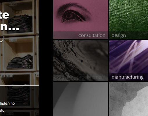
Once in a while its good to push the boundaries and test your limits. That’s exactly what we did when EB Designs International (EBDI) approached us regarding a new website. A highly interactive experience for the user, this site is full of subtle touches that aim to provide the WOW factor.

“Your input and transparency has been very much appreciated and has contributed to the delivery of a very well received website.”

Joe Giammalva

EBDI are a Northamptonshire based company who operate internationally offering ‘complete retail solutions’. A prestigious client portfolio to their name, they felt they needed a website that really showcased their talent and backed up their industry credibility.

With that in mind we got creative and thought up ways that we could make this website something special. The end product serves up a high concept, attention grabbing website with an interactive edge. This website is designed to be explored and engaged with to get the full experience. A sleek, minimalistic and stylish design that incorporates cutting edge web technologies to help bring the site to life. Instinctive navigation, imaginative use of strong imagery and bursts of colour bring a high level of usability and focus towards the user-centric content within.

Visit the site at ebdi.uk.com and let us know what you think.
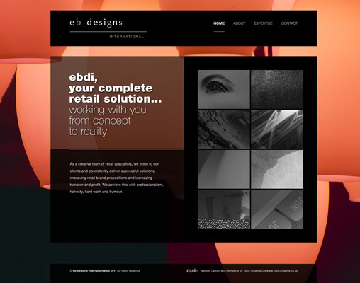
EDBI website designEDBI animated sub navigation


Author Chris Anderson


Toxic Creative - RESULT DRIVEN DESIGN & MARKETING
We’re based in Northampton and are experts in all aspects of graphic designwebsite design and marketing, from dynamic websites and printed literature to logo design and brand development … we do it all.


Posted in: Website Design Also tagged , , , |

NEXT Clothing Graphics – Kids with style


Retail super-brand Next were looking for some ‘on trend’ jersey graphics for their core boys range. Never ones to turn down a new challenge we leapt at the chance.

High street fashion gurus Next can be found in every major town across the UK. With such a strong identity and specific demographic, it was important our designs were not only ‘on-trend’, but also reflected the quality and style associated with the brand.

Researching the fashions of the moment gave us plenty of inspiration and a clear idea of the direction to go in. As we’d never attempted clothing graphics before, it was vital for us to build a base of knowledge and ideas before even a sketch was made. As you would imagine, the team we worked with were all fashionistas and came highly prepared with reams of reference material and ideas of themes they wanted to see turned into tops. With stacks of research by our side we created some fashionable, highly stylised looks that would appeal to children and parents alike.

Bright colours and eye-catching graphics were the main features of our final jersey graphics. A fresh and fashionable set of designs with big block messages and images that really appealed to boys in the age range. Overall we feel our first crack at clothing graphics was a success… Milan here we come.


Author Chris Anderson


Toxic Creative - RESULT DRIVEN DESIGN & MARKETING
We’re based in Northampton and are experts in all aspects of graphic designwebsite design and marketing, from dynamic websites and printed literature to logo design and brand development … we do it all.

Posted in: Graphic Design Also tagged , , |
  • JOIN OUR
    MAILING LIST
    for Tips, Advice and News

    * = required field
    Please tick the subjects that interest you


  • Categories

  • JOIN OUR
    MAILING LIST
    for Tips, Advice and News

    * = required field
    Please tick the subjects that interest you


  •