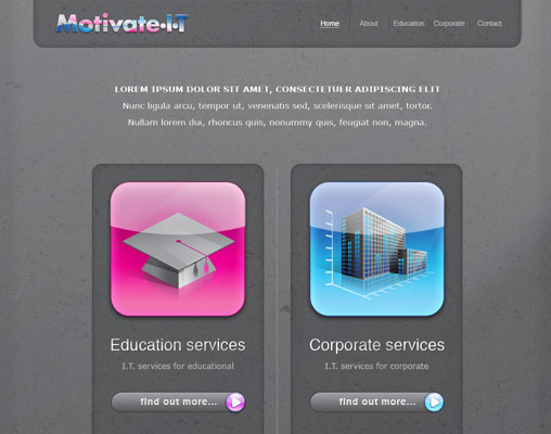
Your home page web design is a personal and custom extension of your business. Everything about it, from its appearance to its content and layout reflects your business. Your home page is your first impression, but it serves a larger purpose. There is some information you need on your home page, regardless of what you want it to look like. After all, it’s the page most people see most often, so it needs to work for you.
1. Contact Information
Studies have shown that a shocking number of small business websites lack basic contact information on their home pages. 75 percent of them don’t have a contact e-mail. 60 percent lack a phone number. These are basic elements of a business. How can a new customer contact you if they don’t have these bits of contact information? Maybe you have a contact page, but how much business are you losing because people don’t visit it?
At the absolute minimum, your home page needs your contact e-mail and phone number. If you have a physical address, you may want to include the relevant contact information for that as well. You never know who might be looking for it, or what business you’re missing by not having it.
These details will also help you be found when people search for your location. We can help in your Localised SEO requirements and web design so give us a call to discuss what we can do.
2. Relevant Images
A picture is worth a thousand words. On the Internet, where content is at a premium and reader attention is worth more than gold, being able to convey a thousand words to potential customers in the space of a picture is invaluable. Your home page needs a few images, but more importantly, these images need to be related to your business. If you sell sports equipment, show pictures of that equipment. If you’re a house painter, show pictures of homes you have painted. Proudly display your wares or your skills.
Avoid the pitfalls of amateur web design. Your images do not need to shake, they don’t need to spin, they don’t need to be animated in any way. A simple slideshow is about as fancy as you want to get. If you think an animated tiled background or a spinning icon or an animated flame is a good idea, you should probably hire out your web design to someone else who knows what they’re doing (I think I could recommend a smiley team of pros who could help ;).
3. Easy Navigation
It’s astounding how easily you can find websites designed for small businesses that are virtually impossible to use. Your home page should be treated like the title page, introduction and index of a book simultaneously. Web conventions state that your navigation should be a bar across the top of the screen or a column down the left side. Trying an unconventional navigation structure makes it just that much harder to find the information your customers are looking for.
Your navigation buttons should be clearly marked with words that indicate what the link contains. Fancy graphics or subtly related phrases don’t work. Consider any information you want your customers to have easy access to. A FAQ document, a more detailed contact page, a gallery of photos, company background and shipping options are all potential pages to list.
Also, make sure your links work. Google Webmaster Tools or manual clicking can check the links. It’s important that you don’t have broken links, both for SEO purposes and for customer satisfaction. Broken links keep customers from completing their purchases.
4. An E-mail Signup Field
Do you send out a regular newsletter? You probably should. A regular newsletter encourages customers to remember your business. You can provide valuable information, important changes to your site or your physical location, new contact information and even offers and deals. Offer rewards for anyone who signs up through your home page. There are plenty of options if you need software to set up a mailing list for you.
A newsletter does two things. First, it shows your customers that your business is active. Second, it gives you a way to transmit important information to customers that don’t regularly check your website. If you change locations, have special sales or events going on, it’s worth it to be able to communicate with your customers quickly and easily.
5. Social Media Integration
Does your business have a Business Page on Facebook? Do you have a Twitter account to share your quick updates? Do you have a profile on LinkedIn so you can network with other businesses and potential employees? The one I personally feel to be even more crucial is the new Google+ Business Pages. If not, you should. If you do, you should have links to these social media sites (and any others you have a presence on) somewhere on your home page.
If your home page doesn’t have these basic essentials, your site isn’t working for you. You need to take advantage of every potential means of gaining customers and customer retention. Thankfully, every one of these tips makes your site that much more professional.
Author Chris Anderson
Toxic Creative – RESULT DRIVEN DESIGN & MARKETING
We’re based in Northampton and are experts in all aspects of graphic design, website design and marketing, from dynamic websites and printed literature to logo design and brand development … we do it all.


Connect with us