How do you design a website that works for everyone? PC, tablet, smart phone and virtually any other Internet-capable device users all want the convenience of using their own devices to connect to the plethora of available websites.
It’s now official, U.K. residents are consuming more data on their phones or tablets than any other country. And with statistics also showing that responsive websites get more pages views, increased visit times and site conversions (sales or enquiries), responsive web design is a must.
If you don’t provide your website users with an adequate all round experience they will either have to suffer the endless monotony of zooming and scrolling or find a suitable desktop computer to use. For some users this is a mere inconvenience, while others may not be able to use the site at all. This sort of substandard treatment will cost you custom.
The solution to this problem historically has been to design a site that detects the device being used to browse and redirects the user to a site designed to handle them. Many sites have such mobile versions and it has worked out well enough. As technology changes and improves, however, more and more variations to the site become necessary. Sites that have adapted will need to continually change, while late adopters find it even harder to make the leap.
The new solution to this issue is Responsive Web Design, and it promises to change the field drastically.
What is responsive design?
The idea behind responsive web design is to have a single site that adapts to whatever device is visiting it. No longer will you have to detect the device and tailor a site to that device, changing it when the device specs change and keeping up on all the new technology. Instead, your site will detect the capabilities of the device and scale the site to it. Visiting the site on a PC, a tablet and a smart phone will show the same site in the same location, tailored to the display capabilities of the device.
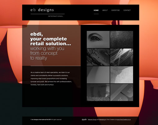
A few good examples of this are listed below. Once on each site resize your browser window to see the layout change to fit.
Creating a responsive site sounds intimidating, but it’s a valuable investment. Instead of having to create and maintain multiple mobile sites and the core desktop site, the site owner will only have to maintain the one responsive site.
How responsive design works
The primary factor in responsive web design is screen resolution. The width and height of the screen is an easy way to determine the scale of the device being used to access a site. A 1000+ pixel width screen indicates that the user is on a typical desktop or laptop PC. Smaller screens might indicate a tablet with a touch interface. Even smaller screens show the user is browsing on a smart phone, and require a more compact interface.
Scaling your site to the screen size is an easy way to allow any user to use it. Each element has a certain priority. As the screen size is reduced, the available space needs to be used for navigation and content more than flashy graphics. As the screen lowers into phone widths, things like small, dense clusters of text and text links become obsolete and are replaced by large and easy navigation buttons.
Passing Fad or Lasting Trend?
Web trends come and go. Some change the face of the Internet entirely, notably the break away from table and iFrame navigation into the realms of divs and CSS. Others, like the Web 2.0 revolution, leave a mark but fade into obscurity. Is Responsive Design another one of the fads that will soon pass and be replaced by a new status quo?
Most experts agree that as technology improves and market saturation increases, smart phones and tablets will become the method of choice for browsing the web. That means a site that caters to mobile users will benefit from early adoption. It can therefore be deemed that responsive web design is a great way to cater not only to current technology, but to future devices as well.
Author Chris Anderson
Toxic Creative – RESULT DRIVEN DESIGN & MARKETING
We’re based in Northampton and are experts in all aspects of graphic design, website design and marketing, from dynamic websites and printed literature to logo design and brand development … we do it all.


Connect with us