The University of Northampton – Graphic Communication Degree Show 2012

Last night the final year students from the Graphic Communication & Illustration courses at the University of Northampton showcased work in their end of year exhibition. We went along to show our support for the course and to see the work of these talented up and coming designers.

The work on display was of a very high standard, and it was great to see a wide array of styles including a great deal of web & multimedia projects. The Illustration course had some amazing work on display, covering many interesting styles and really showed some strong talent.

Well done to all of the students that have clearly worked extremely hard over the past year to make the show the success it was.

We wish them the best of luck and look forward to seeing their future contributions to the industry.


Author Kristan Whitley


Toxic Creative - RESULT DRIVEN DESIGN & MARKETING
We’re based in Northampton and are experts in all aspects of graphic designwebsite design and marketing, from dynamic websites and printed literature to logo design and brand development … we do it all.

Posted in: Toxic Talk & News Also tagged |

DHL & Boots, 2 giant brands, 1 giant challenge

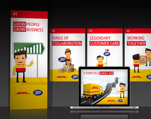
We are extremely proud to have teamed up with logistics goliath DHL to design the graphics for their Boots distribution network annual conference 2011.

When DHL came calling we were over the moon! A ‘new look’ conference styling was required to help fully engage with the attendees and aid the communication of DHL’s plans for moving forward during 2011 and into 2012.

Two big names in one conference meant the pressure was really on to create something special. After initial meetings with their team to discuss their main objectives and initial brainstormed ideas, the Toxic team got our heads together and laid out our vision for the best route to take (logistics puns are fair game here).

As you would imagine, DHL had a very clear and concise plan of what needed to be communicated. To make things as straightforward and punchy as possible, the big picture was condensed down to ’5 steps to success’.

The conference look and feel had to fully engage the 1,500 attendees, so it was vital we created graphics that were striking, yet supportive of the strong overall message being portrayed. To do this we personalised the message with an illustrated character that was representative of the DHL team ‘en route’ to delivering success (sorry, I couldn’t help myself).

At the conference the graphics went down a treat, gaining compliments from both attendees and those involved in its development. Soon after the conference we were asked to develop the theme into posters, reference booklets and communication boards to be used in all their distribution centres, so here’s to what could be a blossoming relationship.

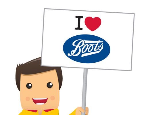
DHL conference graphics rangeDHL cover graphicI love Boots graphic


Author Chris Anderson


Toxic Creative - RESULT DRIVEN DESIGN & MARKETING
We’re based in Northampton and are experts in all aspects of graphic designwebsite design and marketing, from dynamic websites and printed literature to logo design and brand development … we do it all.

Posted in: Graphic Design Also tagged , , , , , , , |

Creative marketing for a multi council partnership

We were asked by the Northamptonshire Improvement and Efficiency Partnership (made up of the 4 local councils) to devise a marketing campaign that fully engaged with its specific target market. We were determined to showcase our talent, but little did we know that we’d be making a star in the process (all will be revealed).

The partnership is made up of Northampton Borough Council, Corby Borough Council, East Northamptonshire Council and South Northamptonshire District Council, so we knew from the get-go that this was no ordinary project.

The brief was to…

Create a core message which encourages customers to adopt more efficient access channels and payment methods

The problem was…

Some customers are unaware of available facilities, unaware of their entitlements, and/or wary of change

To get the message across we wanted to create a campaign that was completely different than the audience is used to seeing whilst still remaining appropriate to all the various target demographics (an easy task this is not). We cracked out the coffee, switched on the strategic sides of our brains and started to develop a variety of potential approaches.

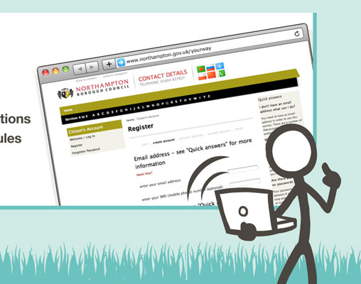
We had conceived ‘Jo’ (our star in the making). Jo, an illustrated stick figure, by his/her very nature is non ethnic specific and non gender specific. The idea was that ‘Jo’ would relate to ‘the people’, adapted accordingly to appear in a variety of scenarios and be easily accepted by all.

Our campaign message was…

Your time,
Your place,
Your way!

Jo would feature in all campaign elements including bespoke direct mail and micro-sites for each partner. At the crux of each communication was Jo in illustrated scenarios relating directly to the different specific tasks in hand, Jo played the role of the public whilst also helping to explain the solutions on offer.

Our new favourite stick figure had undoubtedly become the star of the campaign, next stop, ‘Jo’s T.V. Talk Show’.
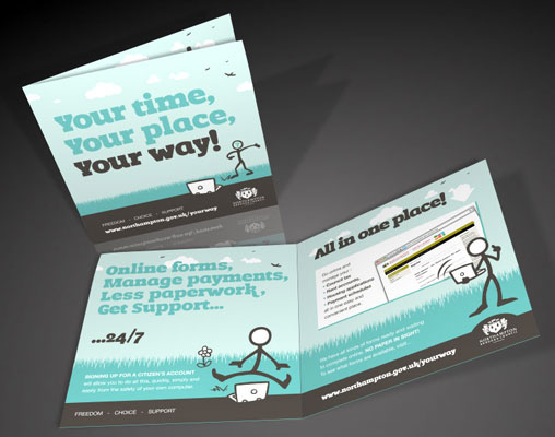
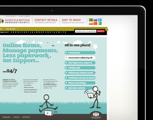
Council branding and leaflet conceptCouncil website conceptCouncil concept illustration style


Author Chris Anderson


Toxic Creative - RESULT DRIVEN DESIGN & MARKETING
We’re based in Northampton and are experts in all aspects of graphic designwebsite design and marketing, from dynamic websites and printed literature to logo design and brand development … we do it all.
Posted in: Marketing Also tagged , , , |

A website of style & substance

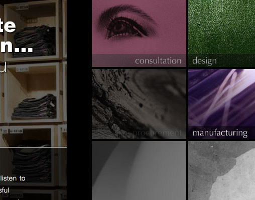
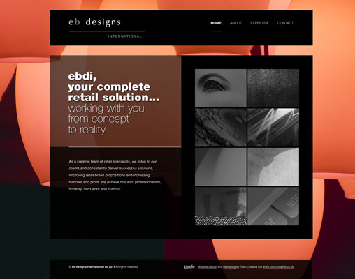
Once in a while its good to push the boundaries and test your limits. That’s exactly what we did when EB Designs International (EBDI) approached us regarding a new website. A highly interactive experience for the user, this site is full of subtle touches that aim to provide the WOW factor.

“Your input and transparency has been very much appreciated and has contributed to the delivery of a very well received website.”

Joe Giammalva

EBDI are a Northamptonshire based company who operate internationally offering ‘complete retail solutions’. A prestigious client portfolio to their name, they felt they needed a website that really showcased their talent and backed up their industry credibility.

With that in mind we got creative and thought up ways that we could make this website something special. The end product serves up a high concept, attention grabbing website with an interactive edge. This website is designed to be explored and engaged with to get the full experience. A sleek, minimalistic and stylish design that incorporates cutting edge web technologies to help bring the site to life. Instinctive navigation, imaginative use of strong imagery and bursts of colour bring a high level of usability and focus towards the user-centric content within.

Visit the site at ebdi.uk.com and let us know what you think.

EDBI website designEDBI animated sub navigation


Author Chris Anderson


Toxic Creative - RESULT DRIVEN DESIGN & MARKETING
We’re based in Northampton and are experts in all aspects of graphic designwebsite design and marketing, from dynamic websites and printed literature to logo design and brand development … we do it all.


Posted in: Website Design Also tagged , , , |

Getting Clinical – NHS Event Literature

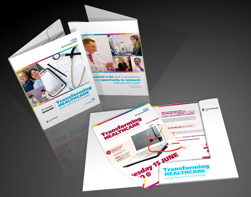
An assortment of event literature was in store when we were approached by United Health UK and NHS Northamptonshire for a collaborative summit.

The summit went very well, phewee!
Thank you so much for all your help – look forward to working with you soon.

Rachel Taylor

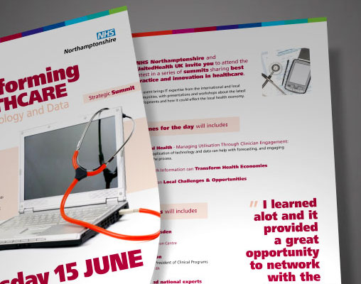
United Health the global health and well-being experts are working in close partnership with NHS Northamptonshire. Their joint summit was formed to provide knowledge to NHS staff regarding the advancements of technology in the NHS, and they approached our team to design and produce a communication styling to generate a buzz around the event and stir up interest to entice prospects attend.

We knew this would be a great project to get our teeth stuck into and instantly had ideas of what was needed to make these communications work to full potential.

The project called for a mainly NHS-centric aesthetic whilst marrying up the branding of both collaborating parties. Using white space as a deliberate feature we were able to give the event styling the clean look it warranted.

With a colourful yet professional overall look and feel the literature generated a lot of interest in the event and helped to make it a great success. With technology such a vital part of modern healthcare it was a fantastic project to be a part of (plus it let us show our love for all things tech!)

NHS conference literatureNHS cover and leafletNHS Poster and leaflet


Author Chris Anderson


Toxic Creative - RESULT DRIVEN DESIGN & MARKETING
We’re based in Northampton and are experts in all aspects of graphic designwebsite design and marketing, from dynamic websites and printed literature to logo design and brand development … we do it all.

Posted in: Graphic Design Also tagged , , |

NHS Northamptonshire micro website

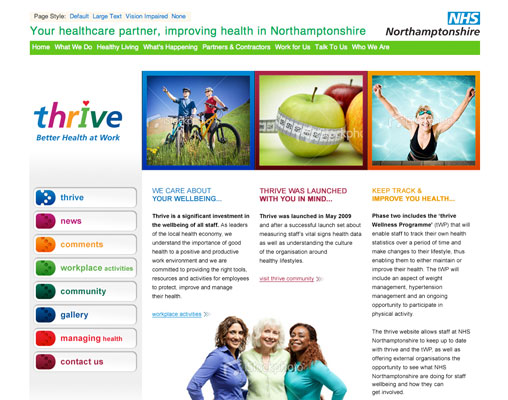
A collaboration with NHS Northamptonshire allowed us to get all healthy minded (a new experience for many of us) during the website design process for their new ‘Thrive’ branded micro-site.

To be brutally honest…
I’m rather pleased with everything you produced,
thank you!

Neil Dickson

The Thrive NHS sub-brand was formed to become the voice of healthy living for NHS employees. The micro-site design had to work as part of the current NHS Northamptonshire website, however we were allowed creative license in the process to enable Thrive to have it’s own more welcoming voice.

A friendly and appealing website was required, so the end solution included inspirational and healthy themed photography. We knew that photography of ‘real’ people doing ‘real’ things would help emphasise the essence of community and well-being, so this became our key focus during design.

Working alongside our local NHS was just what the doctor ordered (is no-one in charge or editing out these quips?).

NHS Northamptonshire Thrive website design


Author Chris Anderson


Toxic Creative - RESULT DRIVEN DESIGN & MARKETING
We’re based in Northampton and are experts in all aspects of graphic designwebsite design and marketing, from dynamic websites and printed literature to logo design and brand development … we do it all.

Posted in: Website Design Also tagged , |

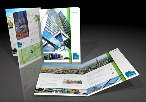
An iconic building requires an iconic brochure

Working with such instantly recognisable and imposing architectural photography opens the door to so many exciting design opportunities.

Having had many brochures produced over the years, I have never been more pleased with the creativeness and desire to give me what I wanted at the same time as offering expert advice.

Giles Fuchs

When Office Space, a Northamptonshire based supplier of national serviced offices, commissioned our team to design a new sales brochure promoting their newest acquisition we were delighted as we could call upon the fantastic views offered by the building, London’s Euston Tower.

They came to us for a brochure that would help to promote Euston Tower in all its glory. The stunning photography was a great kick off point and helped us to make some crucial design decisions early on. Bright, large images to show off the beautiful view, on brand colour schemes and some great icons worked in harmony to create an elegantly simplistic look and feel to match that of the city dwellers soon to be gracing it.


Author Chris Anderson


Toxic Creative - RESULT DRIVEN DESIGN & MARKETING
We’re based in Northampton and are experts in all aspects of graphic designwebsite design and marketing, from dynamic websites and printed literature to logo design and brand development … we do it all.
Posted in: Graphic Design Also tagged , , , |

Corporate Brand Identity & Website

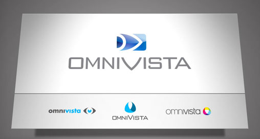
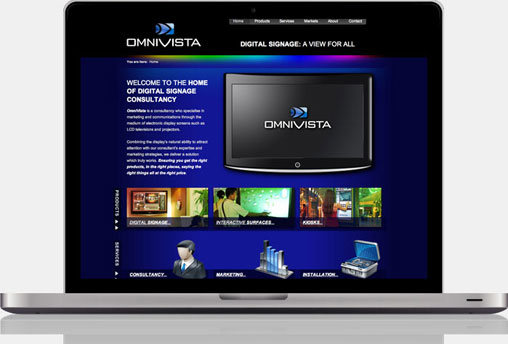
OmniVista (based in Northampton) operate within the constantly evolving world of Digital Signage. They approached us in need of a distinctive identity, corporate website and an assortment of engaging marketing literature. We set about building a brand worthy of any corporate giant to help firmly place OmniVista on the map.

The website has boosted business considerably, and we have received many glowing comments regarding its design and usability. I would recommend the Toxic Creative team to anybody that needs that little bit extra, because they unfailingly deliver where it counts.

Anthony McMorrow

Due to the marketing know-how already within the company, they had a very specific idea of the direction they wanted to go and specific goals to achieve. That left us to concentrate purely on design!

The brand identity had to have a corporate edge, a clean and crisp feel and a sense of professionalism that’s vital within this particular marketplace. When devising the logo we aimed at bringing together the key elements of OmniVista’s products, services and vision, highlighting each element in a cutting edge, glossy style.

We built upon this styling for the website, creating an interactive, user focussed site that helped portray the knowledge and quality of OmniVista’s offering. Embedded videos, interactive roll overs and other engaging features aimed to make every visit to the site an experience.

The glossy, modern look and feel added significant emphasis to the corporate, professional edge the company was looking for. The result was a quality cohesion across the various marketing mediums the company was set to enter into.


Author Chris Anderson


Toxic Creative - RESULT DRIVEN DESIGN & MARKETING
We’re based in Northampton and are experts in all aspects of graphic designwebsite design and marketing, from dynamic websites and printed literature to logo design and brand development … we do it all.
Posted in: Website Design Also tagged , , , , |
  • JOIN OUR
    MAILING LIST
    for Tips, Advice and News

    * = required field
    Please tick the subjects that interest you


  • Categories

  • JOIN OUR
    MAILING LIST
    for Tips, Advice and News

    * = required field
    Please tick the subjects that interest you


  •