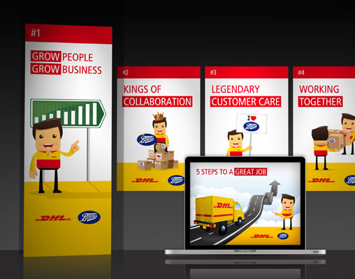
We are extremely proud to have teamed up with logistics goliath DHL to design the graphics for their Boots distribution network annual conference 2011.
When DHL came calling we were over the moon! A ‘new look’ conference styling was required to help fully engage with the attendees and aid the communication of DHL’s plans for moving forward during 2011 and into 2012.
Two big names in one conference meant the pressure was really on to create something special. After initial meetings with their team to discuss their main objectives and initial brainstormed ideas, the Toxic team got our heads together and laid out our vision for the best route to take (logistics puns are fair game here).
As you would imagine, DHL had a very clear and concise plan of what needed to be communicated. To make things as straightforward and punchy as possible, the big picture was condensed down to ’5 steps to success’.
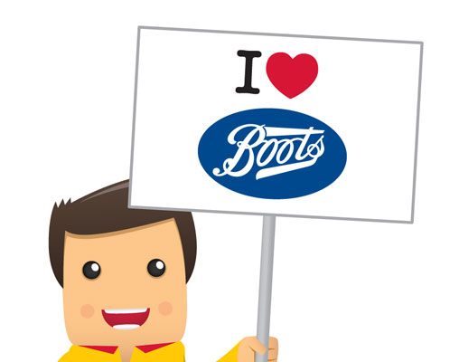
The conference look and feel had to fully engage the 1,500 attendees, so it was vital we created graphics that were striking, yet supportive of the strong overall message being portrayed. To do this we personalised the message with an illustrated character that was representative of the DHL team ‘en route’ to delivering success (sorry, I couldn’t help myself).
At the conference the graphics went down a treat, gaining compliments from both attendees and those involved in its development. Soon after the conference we were asked to develop the theme into posters, reference booklets and communication boards to be used in all their distribution centres, so here’s to what could be a blossoming relationship.
Author Chris Anderson
Toxic Creative - RESULT DRIVEN DESIGN & MARKETING
We’re based in Northampton and are experts in all aspects of graphic design, website design and marketing, from dynamic websites and printed literature to logo design and brand development … we do it all.


Connect with us