Biggest Web Trends for the Year 2013

Web design evolves at a rate that is nearly impossible to track. Since a website can go live mere minutes after it has been created, trends and influences can be tracked in a matter of days. Sites can be edited to reflect aesthetic shifts as those shifts are occurring; savvy web designers will never fall behind current trends if they are willing to edit constantly. Websites can be edited on a surface level to reflect the public’s preferences for colour schemes or logo appearances. They can also be altered on a structural level. The way consumers spend money online can spark changes in the way corporate websites are built. Ad placement grows sleeker as consumers become familiar with current marketing techniques and become immune to them.

Web trends no longer apply to just websites. All aspects of online marketing are linked. A website must be easily viewable on smart phones. If it cannot be read or accessed on phones, the company in question will garner a reputation for being out of touch with its target market. A new arena for web designers is touch-screen compatibility. They are only now figuring out the best ways to harness this new technology.

Do right by your customers

Businesses cannot build their websites according to outdated marketing rules. There are many ideas that are prevalent in the marketing industry that do not actually increase corporate profits. These notions treat consumers like they are stupid while still trying to make money off of them. Consumers can tell when a company is out to make some quick money. A telltale sign of a cynical company is a shoddy website with no compatibility features. A business has to prove that it respects its customers and wants to develop long-term relationships with them. Doing this necessitates a larger start-up investment, but it will pay off in droves when the business is able to sustain itself for a long time.

Adjust the marketing plan accordingly

All of these ideas should be reflected in a company’s web design. The company should focus on reaching consumers where the consumers already are. On an obvious level, this means that a company needs to make sure that its site looks nice on a tablet, laptop or phone; the site needs to load quickly and be easy to navigate on all devices of all sizes. On a less obvious level, these ideas point toward a need to tap into what customers think when they are shopping for the products or services that the company offers. It would be a mistake to design a website that reflects only the employees and corporate atmosphere of a business. The site needs to look like it was made for consumers. A business would be more successful if it polled its consumers and adjusted its marketing campaign to reach the people who are buying its services.

Image trends are changing

An interesting trend in web design is the increasing number of pixels that are contained in a single image unit. Designers are creating multiple versions of the same image, with the clearest, most detailed versions made to show up on the newest devices. Another purely aesthetic trend is the use of one big background image that stays in place. Old web templates attached text and smaller images to backgrounds, so the background images would scroll along with the rest of the content. When the large image is fixed in place, all of the content scrolls on top of it. With the background tacked in place, one way of displaying text is placing it on transparent panels. The background is visible underneath rectangles that provide contrast, allowing text to be easily read. This makes text legible without making the images in the background unrecognisable.

Less can sometimes be more

Minimalism is becoming very popular in the youth market. A minimal landing page with a fashionable design can be loaded on any device, and if it links to a more complex main website, there is a greater chance that consumers will visit that site eventually. A landing page doesn’t always have to convey every bit of information about a company. Building a brand and establishing an aesthetic identity is sufficient in some cases.

Some new trends are conducive to rapid consumption of information. A tool bar that stays attached to the top of a browser while the body of a website scrolls underneath it allows a viewer to access search features and other parts of the website without having to roll up to the beginning of the page. Continuous scrolling scripts load new information constantly so customers do not have to click over to new pages to keep reading. A great deal of information can be contained on a single page with sliding panels and circular image bubbles. Instead of overwhelming customers with blocks of text, the same content can be displayed in images with dynamic properties. This way, consumers will enjoy looking at the website and will be more likely to make purchases.


Author Chris Anderson

Toxic Creative – RESULT DRIVEN DESIGN & MARKETING

We’re based in Northampton and are experts in all aspects of graphic designwebsite design and marketing, from dynamic websites and printed literature to logo design and brand development … we do it all.
Posted in: Website Design Also tagged , |

5 Tips to Incorporate into your Home Page’s Web Design

Your home page web design is a personal and custom extension of your business. Everything about it, from its appearance to its content and layout reflects your business. Your home page is your first impression, but it serves a larger purpose. There is some information you need on your home page, regardless of what you want it to look like. After all, it’s the page most people see most often, so it needs to work for you.

1. Contact Information

Studies have shown that a shocking number of small business websites lack basic contact information on their home pages. 75 percent of them don’t have a contact e-mail. 60 percent lack a phone number. These are basic elements of a business. How can a new customer contact you if they don’t have these bits of contact information? Maybe you have a contact page, but how much business are you losing because people don’t visit it? 

At the absolute minimum, your home page needs your contact e-mail and phone number. If you have a physical address, you may want to include the relevant contact information for that as well. You never know who might be looking for it, or what business you’re missing by not having it.

These details will also help you be found when people search for your location. We can help in your Localised SEO requirements and web design so give us a call to discuss what we can do.

2. Relevant Images

A picture is worth a thousand words. On the Internet, where content is at a premium and reader attention is worth more than gold, being able to convey a thousand words to potential customers in the space of a picture is invaluable. Your home page needs a few images, but more importantly, these images need to be related to your business. If you sell sports equipment, show pictures of that equipment. If you’re a house painter, show pictures of homes you have painted. Proudly display your wares or your skills.

Avoid the pitfalls of amateur web design. Your images do not need to shake, they don’t need to spin, they don’t need to be animated in any way. A simple slideshow is about as fancy as you want to get. If you think an animated tiled background or a spinning icon or an animated flame is a good idea, you should probably hire out your web design to someone else who knows what they’re doing (I think I could recommend a smiley team of pros who could help ;).

3. Easy Navigation

It’s astounding how easily you can find websites designed for small businesses that are virtually impossible to use. Your home page should be treated like the title page, introduction and index of a book simultaneously. Web conventions state that your navigation should be a bar across the top of the screen or a column down the left side. Trying an unconventional navigation structure makes it just that much harder to find the information your customers are looking for.

Your navigation buttons should be clearly marked with words that indicate what the link contains. Fancy graphics or subtly related phrases don’t work. Consider any information you want your customers to have easy access to. A FAQ document, a more detailed contact page, a gallery of photos, company background and shipping options are all potential pages to list.

Also, make sure your links work. Google Webmaster Tools or manual clicking can check the links. It’s important that you don’t have broken links, both for SEO purposes and for customer satisfaction. Broken links keep customers from completing their purchases.

4. An E-mail Signup Field

Do you send out a regular newsletter? You probably should. A regular newsletter encourages customers to remember your business. You can provide valuable information, important changes to your site or your physical location, new contact information and even offers and deals. Offer rewards for anyone who signs up through your home page. There are plenty of options if you need software to set up a mailing list for you.

A newsletter does two things. First, it shows your customers that your business is active. Second, it gives you a way to transmit important information to customers that don’t regularly check your website. If you change locations, have special sales or events going on, it’s worth it to be able to communicate with your customers quickly and easily.

5. Social Media Integration

Does your business have a Business Page on Facebook? Do you have a Twitter account to share your quick updates? Do you have a profile on LinkedIn so you can network with other businesses and potential employees? The one I personally feel to be even more crucial is the new Google+ Business Pages. If not, you should. If you do, you should have links to these social media sites (and any others you have a presence on) somewhere on your home page.

If your home page doesn’t have these basic essentials, your site isn’t working for you. You need to take advantage of every potential means of gaining customers and customer retention. Thankfully, every one of these tips makes your site that much more professional.


Author Chris Anderson

Toxic Creative – RESULT DRIVEN DESIGN & MARKETING

We’re based in Northampton and are experts in all aspects of graphic designwebsite design and marketing, from dynamic websites and printed literature to logo design and brand development … we do it all.

Posted in: Website Design
Tagged as:

Think of Your Web Design As Your Marketing Brochure

The new marketing brochure of the 21st century is your webpage. Just like a brochure, your webpage has to have an impressive design. That’s not all though. A colourful brochure is nothing more than attractive filler for your birdcage. Along the same lines, a webpage that is all flash and little substance isn’t going to do much for your marketing efforts. Think about what you look for in a brochure. You probably don’t pay much attention to the colour of the text, the background colour, the pictures, or even the fancy border. You read a brochure to get a condensed version of the information you need to make up your mind about a business, product, or service. The same is true of your webpage. Here are some tips to make your webpage just as engaging as a well-designed brochure:

Using Content in Web Design

Despite all the high-tech advances in web design, content is still king. You can have the best designed website in the world, but it’s not going to entice readers if you’re not really saying anything of value. Think of how you read a newspaper or magazine. You want something that gives you information in a clear, concise way. The same is true of your website. Now, you may want to make some money with your website by advertising. There’s nothing wrong with that, within reason. Ads should never overshadow your content. The general rule is to keep advertising to about 25 percent per page. If you bombard you readers with a ton of ads and very little content, they’re not going to stick around very long. Would you watch a TV show that was 90 percent ads? Additional things to avoid when preparing your content include:

Excessive punctuation

See anything wrong with this line of text?

Call us today!! We have the best service in town!!! Our customers love us! :-) You will too!!!!

You’re basically screaming “notice me” at your reader. Keep punctuation to a minimum. Not every point needs to be emphasised that much. And never use emoticons.

DON’T CAPITALISE TEST

Again, this is distracting. Nobody wants to be hit over the head with text. If you really want to use caps, carefully choose a few words or phrases here and there.

Avoid Distracting Elements in Web Design

Anything that’s blinking, flashing, scrolling, or animated should generally be avoided when you’re trying to get a marketing message across. Just because you can add flashy elements to your website doesn’t mean that you have to toss in everything but the kitchen sink. Keep the focus on your message. You also want to avoid automatic sounds and other distractions. Remember, you’re not designing your website to show off your skills. Getting back to scrolling text, this should really be avoided for a few reasons. First, it forces the reader to read at your pace. Second, it distracts the reader from your marketing message while they wait for the text to scroll along. The second worst offender is background audio. Even if it’s well-intended, it’s a distraction. If you were trying to read a newspaper, would you want somebody poking at your shoulder or whistling? Some other distractions to avoid include:

Pop-up windows

Even if you really have a good reason for wanting to include a pop-up window on your website, fight the urge. It’s an instant distraction.

Text over background images

In the early days of web design, this was thought of as a cool feature. Now, just try actually trying to read the text that’s superimposed over your background images. See the problem?

Too many photos/images/graphics

Photos, images, and graphics are great, but too many of them are distracting and take forever to load. If a visitor has to wait for five minutes for your images and graphics to load, they’re not likely to come back again.

Organize Your Web Content

Once you get your content together, it’s time to get organised  Your site isn’t going to be effective if it looks like everything was just thrown together with little or no thought. The first thing you want is easy navigation. Include a way for your visitors to get back to your home page. When a user gets confused or lost, they like to start over. Use links sparingly; when trying to market something to someone, you don’t want to take them away from your content for too long. Another golden rule of website design for marketing purposes is to avoid excessive clicking. If your home page is a flash page, get rid of it. A “welcome to my site” page is great – and even cute – for your personal website. For marketing purposes, however, you want to get to the substance as soon as possible. Each page of your website should have about 400 words of content. If you have pages that fall short, combine them with other pages.

Other ways to organize your site include:

  • Try limiting page length to roughly 2 screens height
    - An exception to this is articles, if you have really long articles you want to include on your site, you should break them up into easy to read chunks.
  • Use simple backgrounds or contrasting colours
    - If your text and background colour combination hurts your visitor’s eyes, they’re not likely read very much of it.
  • Keep your text easy to read
    - Content is great, but using the smallest font possible to squeeze more text onto a page isn’t beneficial to anybody if they have to use a magnifying glass to read it. The general rule is 12 point text size. As long as we’re on the subject, keep bold, italics, underlining, and other text features to a minimum.

Finally, take the time to spell and grammar check your content. Even a bunch of small errors can be distracting when someone is reading your website. Remember to include tag features such as your company’s name, address, and phone number on every page of your website. Your goal is to create a site that has useful content that is easy to access. Navigation should be a breeze and distractions such as splashy graphics and scrolling text should be avoided. Think about what attracts you to the websites you visit on a regular basis. Apply those same elements to your site.

Happy marketing!


Author Chris Anderson

Toxic Creative Web Design Northampton

Posted in: Website Design Also tagged |

SEO vs PPC – Infographic

So you want to promote your brand new shiny website…

You have heard of Search Engine Optimisation (SEO) and Pay Per Click (PPC) advertising but don’t know which is most suited to your business, industry or website. Well, this handy infographic was made just for you. It puts SEO up against PPC for a fight to the death brawl.

Being creative types, of course we love infographics, but they are not just currently on trend and visually stimulating, but most importantly they present all the facts and figures in a plain and simple way to help compare what is most important. While we are on the subject, would an infographic help explain one of your services or help show the pros and cons of choosing one of your products of a competitors? Just a thought ;)

The statistic that jump out for me was the ‘% of trust’ section:

86% of web searchers trust SEO listings (I think they mean organic) more than sponsored PPC listings

Take a look below and let us know your thoughts.

Note: Click the image to view full size.

Source: unbounce.com


Author Chris Anderson


Toxic Creative - RESULT DRIVEN DESIGN & MARKETING
We’re based in Northampton and are experts in all aspects of graphic designwebsite design and marketing, from dynamic websites and printed literature to logo design and brand development … we do it all.

Posted in: Search Engine Optimisation Also tagged , , , , |

The Basics of E-Commerce Web Design

In short, E-Commerce Web Design is all about Findability and Usability

Despite there being millions of websites on the Internet, you’ll find that almost all of them can be categorised as a different type or variety of web design: There are personal blogs, community forums, search engines, informational pages, and dozens more, all of which have their own specific design and development principles. One of the most common of these varieties is the e-commerce website. What makes these websites unique is that they encompass nearly every major programming language, marketing tactic, and design principle in an effort to market and sell a product through the Internet. As a result, e-commerce web design has nearly become its own subject, since there are so many factors necessary to ensure a successful execution. This post will cover the two primary principles of this area of design and will hopefully leave you with a better idea of what it truly takes to build an excellent e-commerce website.

Find-ability

The Internet is more than a social medium: It’s also the largest global marketplace ever created. For the first time ever, individuals and businesses from all over the world can interact without ever having to travel. While this has made trade far more efficient, it has also inundated markets with an overwhelming number of businesses. As a result, you’ll almost always face some level of competition, regardless of whatever product or service you’re offering. Because of this, the first step to creating a successful e-commerce website is to make sure people can actually find it.

Thankfully, there are many ways to increase the visibility of your website. The most popular of these methods is search engine marketing, which is often abbreviated as just ‘SEM’. As its name suggests, SEM involves making your website easier to find in search engines for given keywords. This can be accomplished in two different ways: Search engine optimisation and paid search engine listings.

Before we delve into these methods, however, it’s important to understand that each relies heavily on choosing the right keywords; after all, when a person is looking for whatever you’re offering, they usually type in specific keywords or phrases into a search engine. As a result, before utilising either – or both – of the aforementioned methods, make sure your keywords are not only relevant to the content of your website, but also aren’t so broad that you’ll face an impossible level of competition.

In the short run, paid listings are the easiest and most effective way to get visibility in a search engine. As its name suggests, you pay a search engine to list your website in the ‘ads’ section of the results page for a certain keyword. After choosing a keywords or key phrase, you’ll then have the option of selecting how much you want to pay the search engine for one click on your link once it’s listed. However, this means that your website’s rank, visibility, and longevity will depend entirely on how much you’re able to spend. If another website similar to yours is willing to pay more per click and has a larger daily budget, they’ll be visible – and therefore receive more traffic.

For long-term results, search engine optimisation – often abbreviated as ‘SEO’ – is the best way to go. Instead of having to pay to be listed in a special advertising section, SEO makes it so that Google naturally ranks your website based on numerous factors found both on and off your website. Effective on-site SEO involves incorporating page-relevant keywords into each page’s file name, ‘Title’ and ‘Keyword’ Meta tags, and of course, written content. Also, we need to keep your code and site structure organised and accessible.

Off-site SEO is also important and comes mainly in the form of backlinks, which are links posted elsewhere that lead to different parts of your website. Whenever a person posts a link to your website somewhere else, Google – depending on the authority of the website that the link was posted on – tends to view that as an ‘up-vote’. One of the best ways to get people to do this is to maintain a frequently updated blog covering various subjects relating to your products that people will find interesting enough to share with others through links.

There’s a lot more to keyword research, paid listings, SEO, and SEM, but the aforementioned practices cover the most fundamental and necessary principles of findability. Alternatives to SEM include being listed in vendor and business directories, buying advertising space on other websites, and much more.

Usability

Getting someone to find your website is only half the battle: The other half is getting them to stay and make a purchase. While elements such as copywriting, pricing strategy and the product itself all play major roles in this, usability – the practice of making sure that your website is easy to use and free of complications – is arguably the most important factor of successful e-commerce web design.

Although every component of your website should be usable, focus on design and layout first. Make sure that your layout is simple: Don’t have too many columns, stick to a pleasing colour pallet, and keep all of your graphics and designs clean and professional. Layout is also important when it comes to marketing practices. Try to keep the most important parts of each page ‘above the fold’, which is the area visible when you first arrive at the page. While the size of this varies between monitors and their respective resolutions, try to keep the area above the fold (approximately 860 pixels in height).

Another important part of usability is navigation. Try not to depend too heavily on drop down bars, and make sure every major section of your website is clearly visible on the navigation bar. Whenever you’re in a certain section, the navigation bar should reflect it: For example, if you find yourself on the ‘About Us’ page, the ‘About Us’ option on the navigation bar should look visibly different from the other options. Steve Krug, a renowned authority in web usability and author of ‘Don’t Make Me Think’, suggests that the chosen navigation option should look different in at least two ways.

Navigation should also come in the form of search boxes, which are still widely used – and even favoured – by many users. A potential customer might know exactly what they’re looking for the moment they come to your website, and will usually navigate to the search box as a result. The search box should always be in the header of each page, have a ‘search’ button directly to the right of the text area, and of course, be functional: Nothing frustrates a user more than a dysfunctional on-site search tool! Remember, the goal of usable web design is to get the user to stay, and many will leave the moment they become frustrated or confused.

The header of your website should also be unchanging between pages. At a bare minimum, it should include your website’s logo, navigation bar, search box, and most importantly, the shopping cart. While these features will vary depending on the complexity of your website, a good rule of thumb is to make sure that everything the customer would ever need can be found somewhere in the header of each page.

The other half to usability involves how customers view, choose, manage, and purchase products. With online shopping cart abandonment rates reaching nearly 60% for most e-commerce websites, making the browsing and ordering processes as easy, streamlined, and hassle-free as possible should be a top priority. Although there are many ways this can be done, the easiest ways to do so are ensuring your pages load fast, making sure factors such as price and availability are clearly displayed, and keeping the cart management and transaction processes as streamlined and simple as possible. One of the best ways to ensure the latter is to have your shopping cart system remember past customer’s payment details. Functions like this not only make transactions easy, but they can also add a whole new level of personalisation to the shopping experience, which is something that many customers look very highly upon.

Like with the previous section covering find-ability, this section was only a small glimpse into the vast world of usability. However, among all of the jargon and seemingly complex design principles, always remember the number one rule of usability: Don’t make the customer think! If you keep this in mind, you’ll find that ensuring a positive user experience isn’t too difficult.

Findability vs. Usability: Which is More Important?

Many will argue that find-ability is the more important of the two, but this is often shot down by arguing the importance of keeping the user on the website; after all, a website is useless if it isn’t functional. On the other hand, there are others who will argue the opposite and say that a website is equally useless if it cannot be found. While both have good points, they’re both half correct: Findability and usability are equally important components of proper e-commerce web design.

When it comes to prioritising, however, focus on usability before anything else, since you can always market yourself later on.


Author Chris Anderson

Toxic Creative - RESULT DRIVEN DESIGN & MARKETING
We’re based in Northampton and are experts in all aspects of graphic designwebsite design and marketing, from dynamic websites and printed literature to logo design and brand development … we do it all.

Posted in: E-commerce Online Stores Also tagged , , , |

A website of style & substance

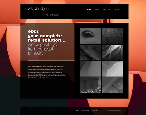
Once in a while its good to push the boundaries and test your limits. That’s exactly what we did when EB Designs International (EBDI) approached us regarding a new website. A highly interactive experience for the user, this site is full of subtle touches that aim to provide the WOW factor.

“Your input and transparency has been very much appreciated and has contributed to the delivery of a very well received website.”

Joe Giammalva

EBDI are a Northamptonshire based company who operate internationally offering ‘complete retail solutions’. A prestigious client portfolio to their name, they felt they needed a website that really showcased their talent and backed up their industry credibility.

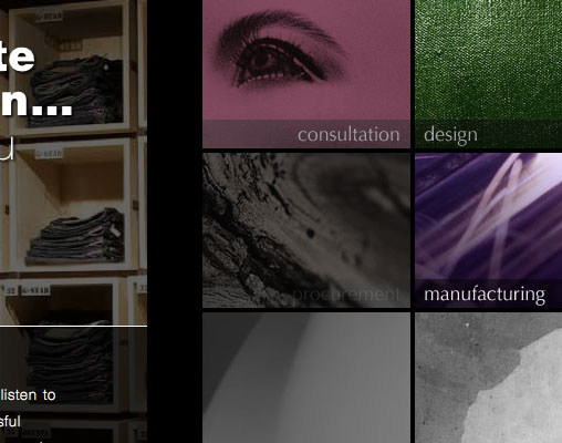
With that in mind we got creative and thought up ways that we could make this website something special. The end product serves up a high concept, attention grabbing website with an interactive edge. This website is designed to be explored and engaged with to get the full experience. A sleek, minimalistic and stylish design that incorporates cutting edge web technologies to help bring the site to life. Instinctive navigation, imaginative use of strong imagery and bursts of colour bring a high level of usability and focus towards the user-centric content within.

Visit the site at ebdi.uk.com and let us know what you think.

EDBI website designEDBI animated sub navigation


Author Chris Anderson


Toxic Creative - RESULT DRIVEN DESIGN & MARKETING
We’re based in Northampton and are experts in all aspects of graphic designwebsite design and marketing, from dynamic websites and printed literature to logo design and brand development … we do it all.


Posted in: Website Design Also tagged , , , |

‘Snappy’ logo & website design

Working with Jonathan Macauley, a Kettering, Northamptonshire based creative photographer, was certainly an unforgettable experience!

To create a brand and website that reflected my personality and complement my imagery required the Toxic Creative team to delve deeply into my head to figure out what’s going on. A foolhardy activity at the best of times, they survived the ordeal mostly unscathed and went on to do a top job all round. Smashing!

Jonathan Macauley

Jonathan’s quirky character was evident throughout his incredible photography. With such a defined personality, we loved creating a personal identity for him and with such a fantastic portfolio to work with we knew we had to create something rather special.

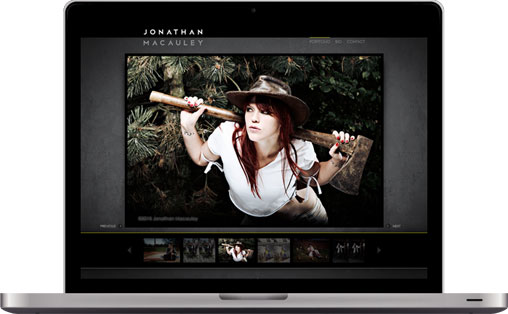
Jonathan’s photography is filled with endless amounts of creativity, with his unique imagination poured into every single photo concept. Going with the norm is certainly not his style, after all he claims ‘sanity is over-rated’, so we set about designing a site that would really let the beautifully unorthodox photos speak for themselves whilst remaining every-part ’jonathan’ throughout.

For his website portfolio we knew the photography had to be the main focus, so we placed them up front and centre. As each photo is breathtaking in its own right, we knew our website design couldn’t detract from the main focus. We placed the photos on a moody black textured background and used a hints of striking yellow accents to highlight key areas.

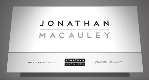
The logo design needed to act as a signature to Jonathan’s work and work alongside everything he is currently producing or may produce in the foreseeable future. For this reason we decided to produce a logo which was timeless in its typographic simplicity whilst still working as a strong calling card for Jonathan and his work.

Have a look at the website and the great photo’s within www.jonathanmacauley.co.uk


Author Chris Anderson


Toxic Creative - RESULT DRIVEN DESIGN & MARKETING
We’re based in Northampton and are experts in all aspects of graphic designwebsite design and marketing, from dynamic websites and printed literature to logo design and brand development … we do it all.
Posted in: Website Design Also tagged , , , |

20/30 Labs – Website Design

We have just completed work on a new website for 20/30 labs, a leading UK water decontamination consultancy in Northampton!

They wanted to modernise their website and freshen up their look and feel. Using white space as a deliberate feature helped achieve the clinical, clean and crisp feel we wanted for the site. With the addition of an eye-catching animation in the header we feel the site is engaging, informative and most importantly, relevant to the company and its industry.

You can see the new 20/30 labs website here 2030lab.com.


Author Chris Anderson


Toxic Creative - RESULT DRIVEN DESIGN & MARKETING
We’re based in Northampton and are experts in all aspects of graphic designwebsite design and marketing, from dynamic websites and printed literature to logo design and brand development … we do it all.
Posted in: Website Design Also tagged |

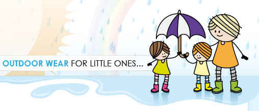
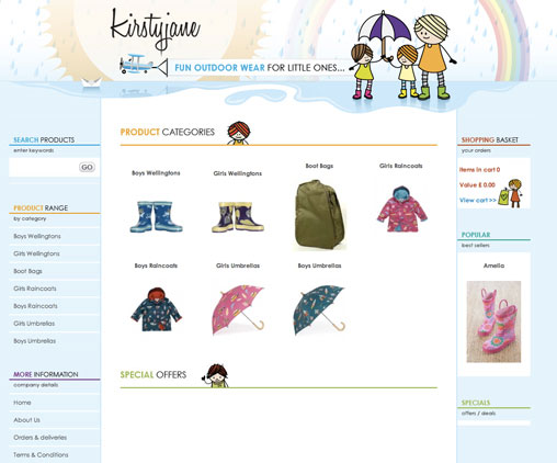
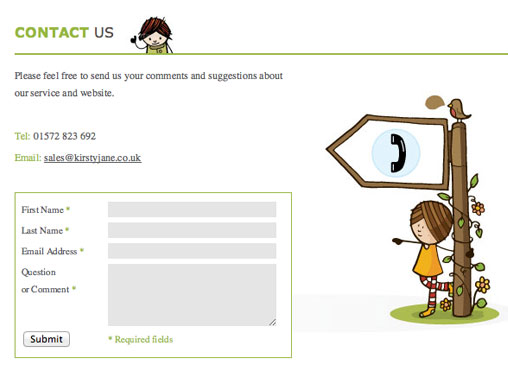
Online store & brand identity for Kirstyjane

We’ve recently completed work on the brand identity, online store and corporate stationary for Kirstyjane, a company that sells fun outdoor wear for kids!

Our aim was to create a fun, friendly and welcoming site that appeals to children and parents alike, which is where the illustrative styling plays it’s part.


Author Chris Anderson


Toxic Creative - RESULT DRIVEN DESIGN & MARKETING
We’re based in Northampton and are experts in all aspects of graphic designwebsite design and marketing, from dynamic websites and printed literature to logo design and brand development … we do it all.
Posted in: Website Design Also tagged , , |

UK Film School creative website design

UK Film School provide students aged between 8-18 the opportunity to experience life in front of and behind the camera.

UK Film School wanted their site to have an urban look and feel, so after brainstorming and a pile of sketches, we designed youthful, edgy & funky layouts inspired by urban landscapes.

Our main challenge was balancing the edgy appeal UK Film School wanted with the information & clarity all websites require.

Take a look and let us know what you think ukfilmschool.org.uk


Author Chris Anderson


Toxic Creative - RESULT DRIVEN DESIGN & MARKETING
We’re based in Northampton and are experts in all aspects of graphic designwebsite design and marketing, from dynamic websites and printed literature to logo design and brand development … we do it all.
 

Posted in: Website Design Also tagged |

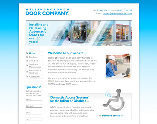
Website design & Google Adwords management for Wellingborough Door Company

Wellingborough Door Company provide door automation solutions for the retail and corporate sectors across the UK, to be asked to design and build their new website was a privilege.

The new website design had to promote both their services and products. Instinctive navigation was essential due to the vast range on offer, as well as a bright and welcoming look and feel.

We also set WDC up with a powerful Google AdWords solution to drive a great deal of traffic to their new website. We are huge fans of the service, as are our clients who will testify that when campaigns are built correctly Google AdWords really helps increase traffic and ultimately boost enquiries and sales.

With an online store in the pipeline, this market leader are certainly not standing still, and we are proud to be with them every step of the way.

Check out The Wellingborough Door Company’s website here www.wdc-autodoors.co.uk

More of our work is on show in our website design projects page.

Wellingborough Door Company Website Design


Author Chris Anderson


Toxic Creative - RESULT DRIVEN DESIGN & MARKETING
We’re based in Northampton and are experts in all aspects of graphic designwebsite design and marketing, from dynamic websites and printed literature to logo design and brand development … we do it all.
Posted in: Website Design Also tagged , |

Online Store for Victoria’s Attic

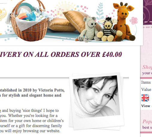
We have just completed creating the brand identity, online store and marketing literature for Victoria’s Attic, an exciting new company selling high quality home furnishings, children’s accessories and more!

If you follow us on Facebook then you’ll already know this and if you don’t, why not? Click here to go to our Facebook page.

As soon as we were approached we knew it would be an interesting challenge and were instantly on board. The aim was to create a classy, sophisticated feel for the store to reflect the quality of the products on offer.

It was a really exciting project to work on and we are extremely pleased with the final result.


Author Chris Anderson


Toxic Creative - RESULT DRIVEN DESIGN & MARKETING
We’re based in Northampton and are experts in all aspects of graphic designwebsite design and marketing, from dynamic websites and printed literature to logo design and brand development … we do it all.
Posted in: E-commerce Online Stores Also tagged , , , , |

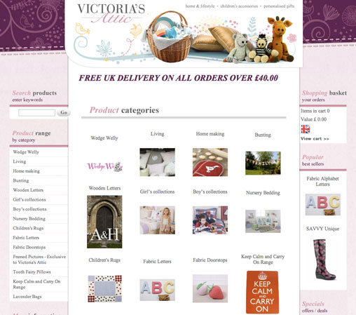
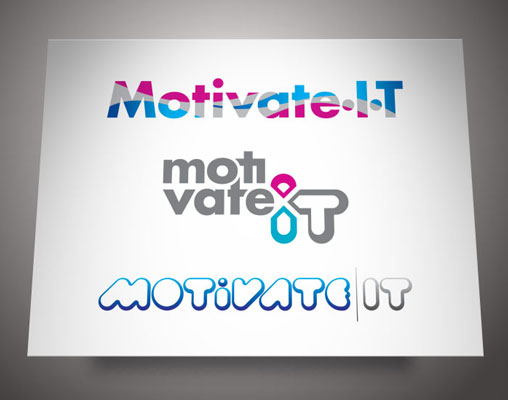
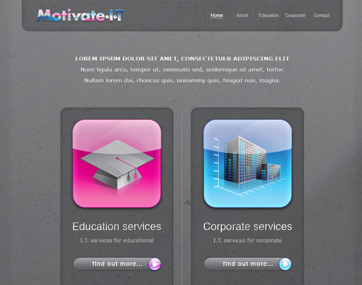
Logo & Website design for Uppingham, Rutland I.T. Services Company Motivate IT

The Rutland based Motivate IT came with a variety of projects, to build their public persona and communications from the ground up. Creating the company branding, logo, corporate stationery and website, it really was a full works project.

They are an I.T. support company and service both the corporate and educational sectors. A dedicated approach to their work, they always put the customer first, a key aspect for consideration when creating the branding, stationery and website.

We gave it a modern yet corporate appeal, with bright bold colours and clear, easily readable typography. The website design was built upon a grey textured background so that the colours would really jump out the page. Straightforward navigation and a clear separation between the two sectors they operate within meant a sophisticated and well focused online communication.

Overall a stylish and classy identity and a functional user-friendly website that promoted the company’s ‘customer comes first’ philosophy.

Watch this space for a link to the website once it has gone live.

See more of our work on our website design projects page.

Motivate IT Logo DesignMotivate IT Website Design


Author Chris Anderson


Toxic Creative - RESULT DRIVEN DESIGN & MARKETING
We’re based in Northampton and are experts in all aspects of graphic designwebsite design and marketing, from dynamic websites and printed literature to logo design and brand development … we do it all.
Posted in: Website Design Also tagged , , , |

Corporate Brand Identity & Website

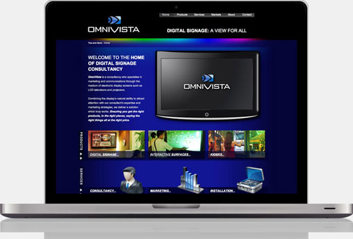
OmniVista (based in Northampton) operate within the constantly evolving world of Digital Signage. They approached us in need of a distinctive identity, corporate website and an assortment of engaging marketing literature. We set about building a brand worthy of any corporate giant to help firmly place OmniVista on the map.

The website has boosted business considerably, and we have received many glowing comments regarding its design and usability. I would recommend the Toxic Creative team to anybody that needs that little bit extra, because they unfailingly deliver where it counts.

Anthony McMorrow

Due to the marketing know-how already within the company, they had a very specific idea of the direction they wanted to go and specific goals to achieve. That left us to concentrate purely on design!

The brand identity had to have a corporate edge, a clean and crisp feel and a sense of professionalism that’s vital within this particular marketplace. When devising the logo we aimed at bringing together the key elements of OmniVista’s products, services and vision, highlighting each element in a cutting edge, glossy style.

We built upon this styling for the website, creating an interactive, user focussed site that helped portray the knowledge and quality of OmniVista’s offering. Embedded videos, interactive roll overs and other engaging features aimed to make every visit to the site an experience.

The glossy, modern look and feel added significant emphasis to the corporate, professional edge the company was looking for. The result was a quality cohesion across the various marketing mediums the company was set to enter into.


Author Chris Anderson


Toxic Creative - RESULT DRIVEN DESIGN & MARKETING
We’re based in Northampton and are experts in all aspects of graphic designwebsite design and marketing, from dynamic websites and printed literature to logo design and brand development … we do it all.
Posted in: Website Design Also tagged , , , , |

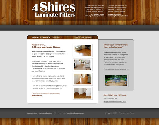
Single page ‘brochure’ website design for Corby based 4 Shires Laminate Fitters

Corby based 4 Shires Laminate Fitters Ltd were after a fresh and inviting website design to promote their skills and services to help drive enquiries and sales.

They had a straight forward list of website objectives so we suggested that we designed a simple single page website that got straight to the point. To add a certain extra level of interest and interactivity we added in an image gallery viewer to help show off their high level of craftsmanship.

As they are a service based company 4 Shires needed the website to have a friendly and approachable feel, making the consumer instantly at ease was a must. A clear layout including a laminate wood background helped to give the website design a modern but homely appeal.

Check out the website here www.4shireslaminatefitters.co.uk

View a selection of our other website design projects.

Website design


Author Chris Anderson


Toxic Creative - RESULT DRIVEN DESIGN & MARKETING
We’re based in Northampton and are experts in all aspects of graphic designwebsite design and marketing, from dynamic websites and printed literature to logo design and brand development … we do it all.
Posted in: Website Design Also tagged |

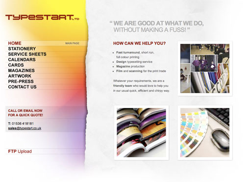
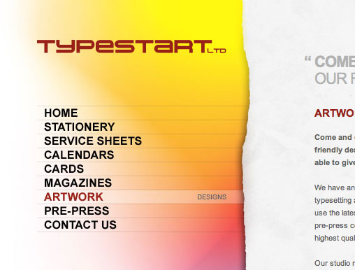
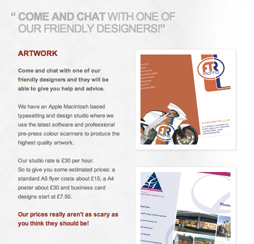
Website design for local print & typesetting company Typestart

We deal with printers on a daily basis, however you would be hard pressed to find a friendlier or more accommodating printers than Typestart.

When we were asked to design Typestart a new website we wanted to create something that portrayed these great qualities whilst also representing their print based skills and services in an uncomplicated and fresh manner.

We are very happy with the end result and Typestart have said the site has been very well received from all.

Visit the site at: www.typestart.co.uk

Typestart navigation designTypestart content area designTypestart home page design


Author Chris Anderson


Toxic Creative - RESULT DRIVEN DESIGN & MARKETING
We’re based in Northampton and are experts in all aspects of graphic designwebsite design and marketing, from dynamic websites and printed literature to logo design and brand development … we do it all.


Posted in: Website Design Also tagged |

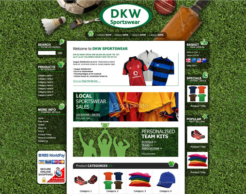
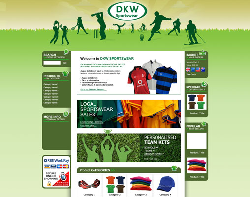
Online store website design for Uppingham, Rutland based DKW Sportswear

Online stores are always interesting projects and the e-commerce website for DKW Sportswear was no different! The Uppingham, Rutland based company sell a variety of sportswear and offer personalised kits for teams.

A vibrant website design with straightforward navigation was vital for DKW to ensure the products on offer were clearly displayed. A blend of green tones throughout, funky silhouettes and a summer play scene gave the site a real sporty appeal.

A great overall effect that promotes the wide range in offer in a clear and engaging way, we’re really proud of the final result.

Check out the site here www.dkwsportswear.co.uk

See more of our Website Design and e-commerce sites on our projects pages.

Online store designE-commerce website design


Author Chris Anderson


Toxic Creative - RESULT DRIVEN DESIGN & MARKETING
We’re based in Northampton and are experts in all aspects of graphic designwebsite design and marketing, from dynamic websites and printed literature to logo design and brand development … we do it all.
Posted in: E-commerce Online Stores Also tagged , |

Start selling online with our ecommerce packages

Low Cost, Quick & Easy Online Shop.

Our Online Store package includes everything you need to start selling your company’s products / services over the internet.

We design and set up the whole system for you, all you need to do is add in your product and service information. This is all done through your browser, you won’t need to use any other software!

We will create a tailor made shop design for your company in line with your brand requirements. Creating the correct first impression and supplying your customers with everything they require is our specialty.

Call and speak to one of our team to find out more…

Online store website design homepageKirstyjane online store design


Author Chris Anderson


Toxic Creative - RESULT DRIVEN DESIGN & MARKETING
We’re based in Northampton and are experts in all aspects of graphic designwebsite design and marketing, from dynamic websites and printed literature to logo design and brand development … we do it all.
 

Posted in: E-commerce Online Stores Also tagged , |

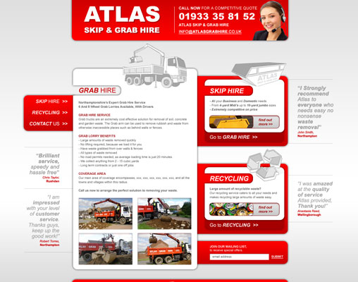
Traffic boosting website design for wellingborough skip & grab hire company

Atlas Skip & Grab Hire are a Wellingborough based company who came to us looking for a website to promote a selection of their every growing services; grab hire, skip hire and waste recycling.

On top of website design we also set them up with a powerful Google AdWords system to boot. An involved project that was great to get on-board with, the end website design is bold and user-friendly.

Atlas were after a website to help drive enquiries for their main three services. To help maximise organic search traffic and communication clarity, we suggested that each service had its own dedicated domain. A consistent visual theme throughout provided the feeling of continuity and the straightforward layout kept user interaction on track. The design highlighted the key features of all services and gave clarity to the information structure.

Managing Google AdWords accounts is never a simple task and requires time to optimise it to success. However having built up our knowledge over the years we were able to significantly boost Atlas’ website performance.

A website design focussed on ease of use with a bold, eye-catching layout was a great way to grab attention for Atlas and all the services they offer.

See the site here www.atlasgrabhire.co.uk

View more of our website design projects.

Atlas Grab Hire Website Design


Author Chris Anderson


Toxic Creative - RESULT DRIVEN DESIGN & MARKETING
We’re based in Northampton and are experts in all aspects of graphic designwebsite design and marketing, from dynamic websites and printed literature to logo design and brand development … we do it all.
Posted in: Website Design Also tagged , |

Charity website design

We are proud to announce the launch of The Finnis Scott Foundation website.

Toxic Creative were commissioned to design, build and host a website to act as the Trust’s main communication to potential grant winners.

Visit the site at: www.finnis-scott-foundation.org.uk


Author Chris Anderson


Toxic Creative - RESULT DRIVEN DESIGN & MARKETING
We’re based in Northampton and are experts in all aspects of graphic designwebsite design and marketing, from dynamic websites and printed literature to logo design and brand development … we do it all.
 

Posted in: Website Design Also tagged |

Sales focused web design

After we completed the Corporate Identity and Advertising campaign for EMS’s newly named AquaCert service, we were asked to Design, Build and Host a website to promote it. This sites features include Online Store and E-Newsletter subscription facility and contact forms.

Visit the site at: www.AquaCert.co.uk


Author Chris Anderson


Toxic Creative - RESULT DRIVEN DESIGN & MARKETING
We’re based in Northampton and are experts in all aspects of graphic designwebsite design and marketing, from dynamic websites and printed literature to logo design and brand development … we do it all.
 

Posted in: Website Design Also tagged , , |
  • JOIN OUR
    MAILING LIST
    for Tips, Advice and News

    * = required field
    Please tick the subjects that interest you


  • Categories

  • JOIN OUR
    MAILING LIST
    for Tips, Advice and News

    * = required field
    Please tick the subjects that interest you


  •