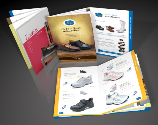
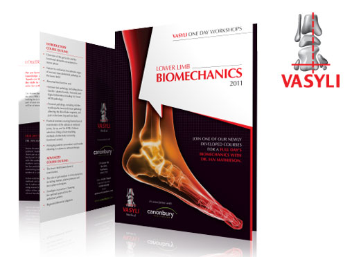
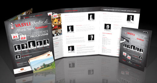
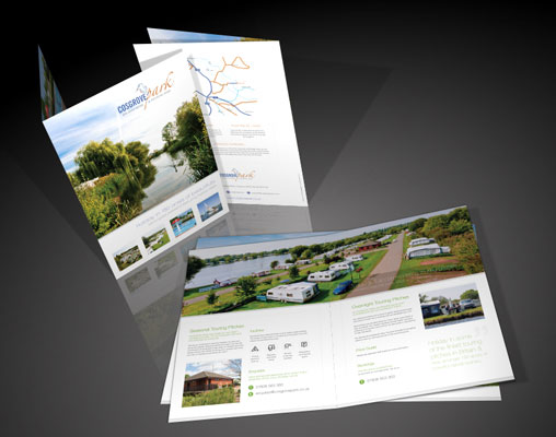
The new marketing brochure of the 21st century is your webpage. Just like a brochure, your webpage has to have an impressive design. That’s not all though. A colourful brochure is nothing more than attractive filler for your birdcage. Along the same lines, a webpage that is all flash and little substance isn’t going to do much for your marketing efforts. Think about what you look for in a brochure. You probably don’t pay much attention to the colour of the text, the background colour, the pictures, or even the fancy border. You read a brochure to get a condensed version of the information you need to make up your mind about a business, product, or service. The same is true of your webpage. Here are some tips to make your webpage just as engaging as a well-designed brochure:
Using Content in Web Design
Despite all the high-tech advances in web design, content is still king. You can have the best designed website in the world, but it’s not going to entice readers if you’re not really saying anything of value. Think of how you read a newspaper or magazine. You want something that gives you information in a clear, concise way. The same is true of your website. Now, you may want to make some money with your website by advertising. There’s nothing wrong with that, within reason. Ads should never overshadow your content. The general rule is to keep advertising to about 25 percent per page. If you bombard you readers with a ton of ads and very little content, they’re not going to stick around very long. Would you watch a TV show that was 90 percent ads? Additional things to avoid when preparing your content include:
Excessive punctuation
See anything wrong with this line of text?
Call us today!! We have the best service in town!!! Our customers love us! :-) You will too!!!!
You’re basically screaming “notice me” at your reader. Keep punctuation to a minimum. Not every point needs to be emphasised that much. And never use emoticons.
DON’T CAPITALISE TEST
Again, this is distracting. Nobody wants to be hit over the head with text. If you really want to use caps, carefully choose a few words or phrases here and there.
Avoid Distracting Elements in Web Design
Anything that’s blinking, flashing, scrolling, or animated should generally be avoided when you’re trying to get a marketing message across. Just because you can add flashy elements to your website doesn’t mean that you have to toss in everything but the kitchen sink. Keep the focus on your message. You also want to avoid automatic sounds and other distractions. Remember, you’re not designing your website to show off your skills. Getting back to scrolling text, this should really be avoided for a few reasons. First, it forces the reader to read at your pace. Second, it distracts the reader from your marketing message while they wait for the text to scroll along. The second worst offender is background audio. Even if it’s well-intended, it’s a distraction. If you were trying to read a newspaper, would you want somebody poking at your shoulder or whistling? Some other distractions to avoid include:
Pop-up windows
Even if you really have a good reason for wanting to include a pop-up window on your website, fight the urge. It’s an instant distraction.
Text over background images
In the early days of web design, this was thought of as a cool feature. Now, just try actually trying to read the text that’s superimposed over your background images. See the problem?
Too many photos/images/graphics
Photos, images, and graphics are great, but too many of them are distracting and take forever to load. If a visitor has to wait for five minutes for your images and graphics to load, they’re not likely to come back again.
Organize Your Web Content
Once you get your content together, it’s time to get organised Your site isn’t going to be effective if it looks like everything was just thrown together with little or no thought. The first thing you want is easy navigation. Include a way for your visitors to get back to your home page. When a user gets confused or lost, they like to start over. Use links sparingly; when trying to market something to someone, you don’t want to take them away from your content for too long. Another golden rule of website design for marketing purposes is to avoid excessive clicking. If your home page is a flash page, get rid of it. A “welcome to my site” page is great – and even cute – for your personal website. For marketing purposes, however, you want to get to the substance as soon as possible. Each page of your website should have about 400 words of content. If you have pages that fall short, combine them with other pages.
Other ways to organize your site include:
- Try limiting page length to roughly 2 screens height
- An exception to this is articles, if you have really long articles you want to include on your site, you should break them up into easy to read chunks. - Use simple backgrounds or contrasting colours
- If your text and background colour combination hurts your visitor’s eyes, they’re not likely read very much of it. - Keep your text easy to read
- Content is great, but using the smallest font possible to squeeze more text onto a page isn’t beneficial to anybody if they have to use a magnifying glass to read it. The general rule is 12 point text size. As long as we’re on the subject, keep bold, italics, underlining, and other text features to a minimum.
Finally, take the time to spell and grammar check your content. Even a bunch of small errors can be distracting when someone is reading your website. Remember to include tag features such as your company’s name, address, and phone number on every page of your website. Your goal is to create a site that has useful content that is easy to access. Navigation should be a breeze and distractions such as splashy graphics and scrolling text should be avoided. Think about what attracts you to the websites you visit on a regular basis. Apply those same elements to your site.
Happy marketing!
Author Chris Anderson
Toxic Creative Web Design Northampton
Connect with us